Bar
An element for adjusting the size or position of an in-app screen within the display, or for manipulating content.

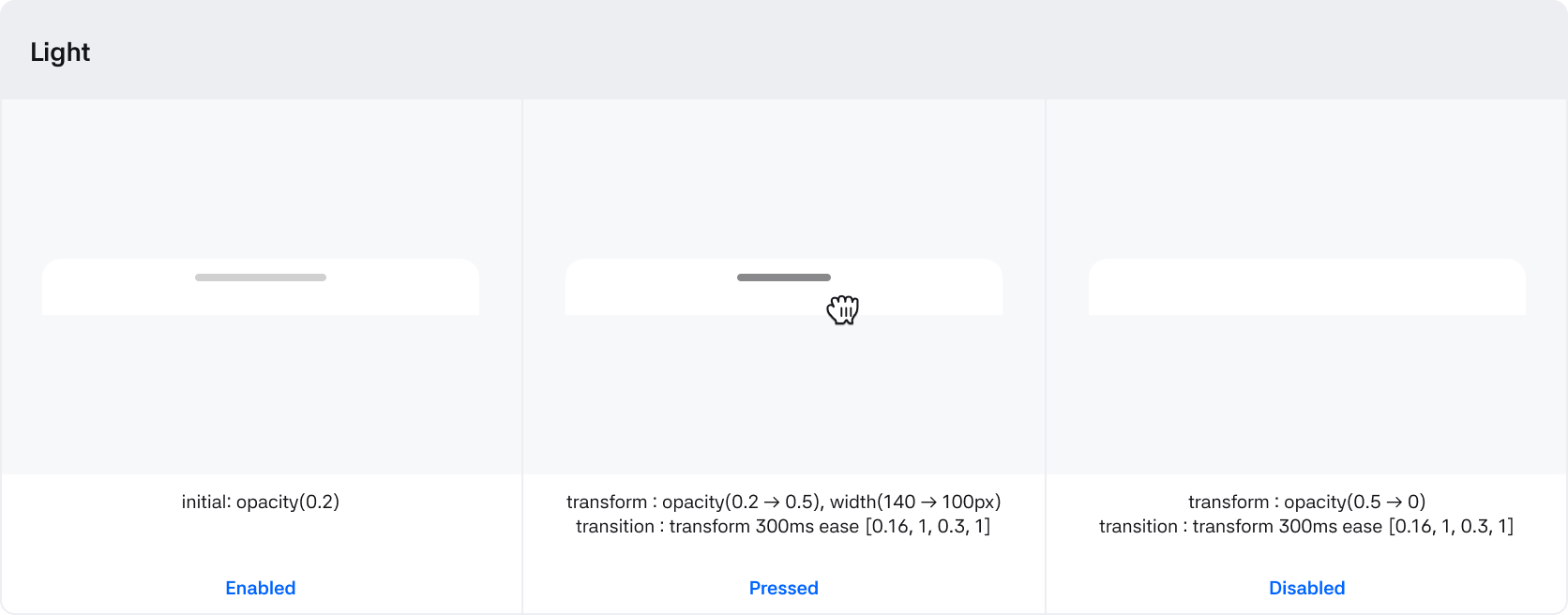
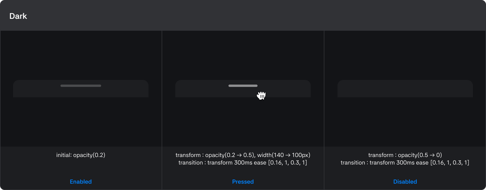
States
| State | Value | Description |
|---|---|---|
| Variant | Light / Dark | Switch depending on the type set in the app |
| Dragging | True / False | Switches to 'True' when it is a draggable window |
| Disabled | True / False | If True, the handle is not visible and it is in a state where drag cannot be controlled |
| Pressed | True / False | State when holding the handle and starting the drag |
Types
| Types | Description |
|---|---|
| App bar | Component for moving and closing the app |
| Window bar | Component for adjusting the app's window size |
| Scroll bar | Component for navigating the app's content |
App bar
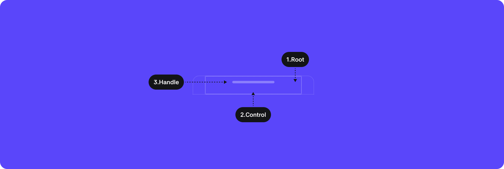
1. Root : The top-level container area that wraps the App bar component
2. Control : The container area that wraps the handle and the minimum drag area
3. Handle : The control element that can be dragged
Behaviors
Window bar

1. Root : The top-level container area that wraps the Window bar component
2. Control : The container area that wraps the handle and the minimum drag area
3. Handle : The control element that can be dragged
Behaviors


Scroll bar

1. Root : The top-level container area that wraps the Scroll bar component
2. Control : The container area that wraps the handle and the minimum drag area
3. Handle : The control element that can be dragged
Behaviors

